Improving Visual Identity
During my time working with Infranord, they introduced a new concept called The Rail Way, which aimed to highlight the core idea of the company. As part of this initiative, they created a new logo that was visually distinct from the main Infranord logo.
Here is Infranords logo and The Rail Way logo:
Here is Infranords logo and The Rail Way logo:
The problem:
My challenge was to create an animated video that would showcase how The Rail Way fits into the larger Infranord ecosystem. Through careful planning and collaboration with the company's leadership team, I was able to create a compelling video that highlighted the ways in which The Rail Way embodies Infranord's core values and mission.
The video proved to be a valuable asset for Infranord, as it was widely adopted and incorporated into the company's presentations and conferences, allowing the message of The Rail Way to be shared across various channels and audiences
The video proved to be a valuable asset for Infranord, as it was widely adopted and incorporated into the company's presentations and conferences, allowing the message of The Rail Way to be shared across various channels and audiences
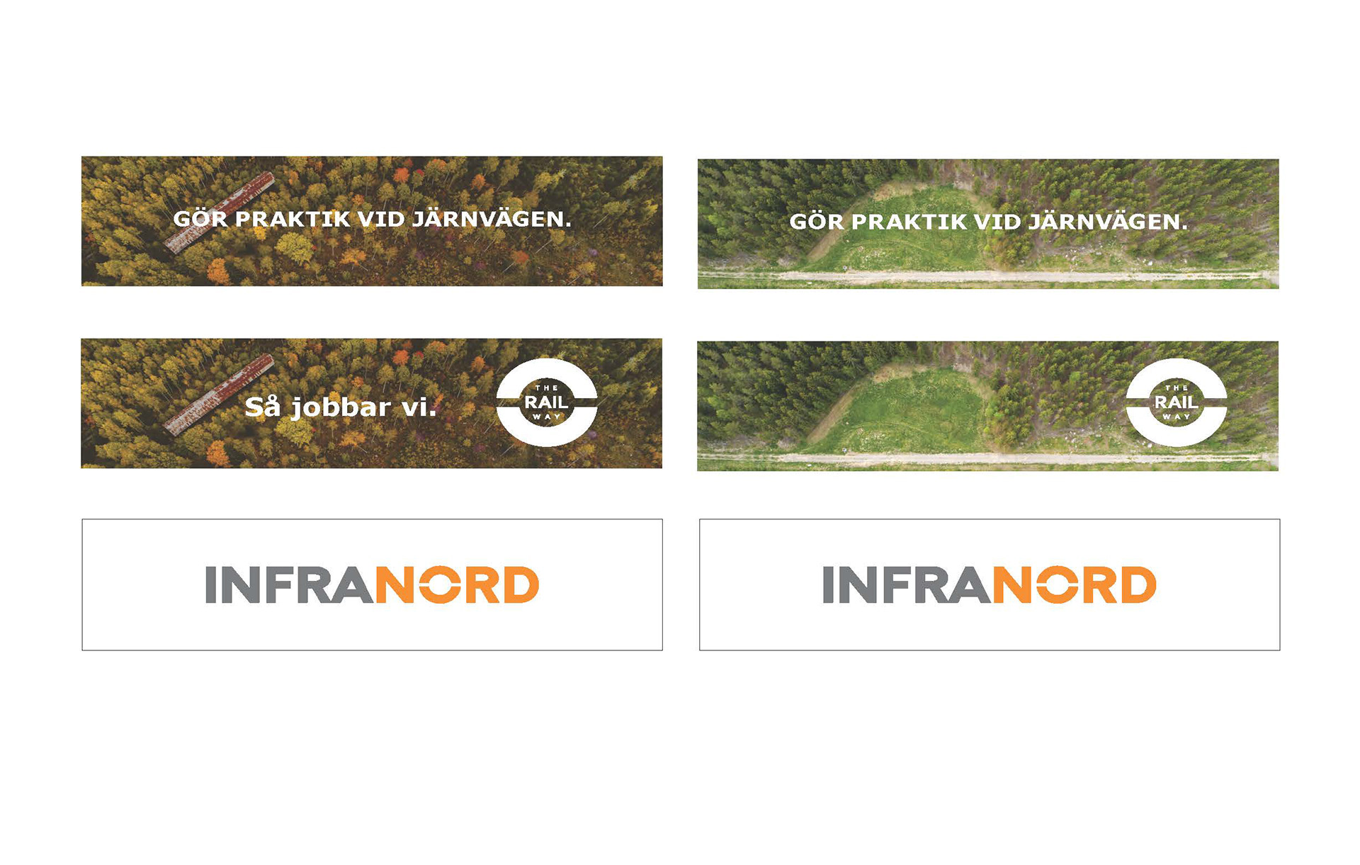
After creating the animated video introducing The Rail Way concept for Infranord, I was tasked with developing a comprehensive corporate identity for this new initiative. This involved designing and producing a range of printed and digital materials, such as roll-ups, posters, and other collateral, to help promote and communicate the message of The Rail Way. By leveraging a consistent visual language and color scheme across all materials, I was able to launch a cohesive brand identity that captured the spirit of the initiative and helped to reinforce its importance to internal and external stakeholders alike
As part of my work on The Rail Way initiative for Infranord, I designed branded takeaways such as notebooks and pens to help reinforce key messaging and increase engagement with the brand


